CRI vs. TM-30: What Do These Color Quality Measures Mean?
If you’ve looked at lighting recently, you may have seen something like “CRI: 83” or “Rf 94”among the alphabet soup of the lighting specs. Another product advertised its great color rendering with two scores and a round graph. What does it all mean?
How a light renders colors is very important—look at yourself in the mirror under a fluorescent light. It’s probably not your most flattering look and that is because fluorescent lamps tend to render color poorly. Beyond looking good in the mirror, color quality is absolutely critical for applications like retail and museum displays.
Since the early 20th century, the standard for measuring how color appeared under different light sources was the Color Rendering Index (CRI). CRI worked for conventional lighting sources like fluorescent, but new LED technology necessitated a new color quality scale that could adequately measure the full spectrum of light from LEDs. Enter TM-30. Here’s how the two different scales work and how their scores should factor into your decision-making:
What is CRI?
Developed in the 1930s and updated in the 1970s, the Color Rendering Index (CRI) was the first industry standard for measuring how color appeared under different light sources.
Consisting of a reference light (typically the sun or an incandescent lamp) and eight pastel colors the CRI scale grades light sources on a 0 – 100-point scale. Light sources are tested on how closely the eight-color palette renders under them compared to the reference light. Each color gets a score and the scores are averaged together in a complicated formula to make on CRI score (e.g. CRI 83).
A score of 100 is perfect and means the light source being tested renders colors exactly the same as the reference light. A score of 80 and above is considered good, while 90 and above is excellent.
CRI’s Limitations
The CRI was an important step forward when it was developed, but it has several limitations. These limitations are becoming more and more apparent as the standard ages and new lighting technology pushes the limits of what is possible.
The eight colors that the CRI scale measures.
At its most basic level, the problem with CRI is that it’s based on only eight pastel colors. The real world has infinitely more colors than eight and they are fully saturated.
A high CRI score doesn’t necessarily mean the light is good. Because CRI only measures how faithfully eight colors are rendered compared to the reference light, unscrupulous manufacturers can “game the system” by developing lamps with high CRI values but poor-quality light.
A further limitation is that only light sources with the same color temperature can be compared under the CRI. So, if you’re measuring a warm (3000k) halogen lamp, you’d have to compare it to the warm setting sun, instead of the cool noontime sun (5000k).
What is TM-30?
A new color rendering standard is gaining traction to deal with the limitations of the CRI: IES TM-30-15. IES stands for Illuminating Engineering Society, which is the organization that developed the scale. Frequently shortened to TM-30, the metric is currently used in conjunction with CRI on packaging, but it is poised to supplant the CRI measurement.
Where the CRI provides a single score, TM-30 is more comprehensive and consists of three parts: a Fidelity Index, Gamut Index and the Color Vector Graphic. These combine to give a more accurate picture of a light source’s color faithfulness and better accounts for the outstanding color rendering abilities of LEDs.
TM-30’s Fidelity Index
Long story short: How closely can a given light source render colors compared to the sun.
A sample of the 99 colors the TM30 scale measures. (Image courtesy of Energy.gov)
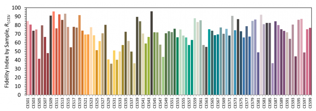
Where the CRI uses eight pastel colors, TM-30’s Fidelity Index (also called Rf) uses 99 colors, chosen from real world objects. Like CRI, Fidelity Index scores go from 0 – 100. A score below 60 is too poor for interior use and a score of 90+ is ideal for a daylight-like appearance.
The 99 colors TM-30 measures are categorized into seven groups (nature, skin color, textiles, paints, plastics, printed material and color systems). This categorization helps because the light source can be tested in application-specific uses. For example, an architect can show how certain colors of paint would render under the light, or a retailer can see how merchandise would display.
TM-30’s Gamut Index
Long story short: How intense are colors under a given light?
The dictionary definition of “gamut” is the “full range or scope of something” and TM-30’s Gamut Index (also called Rg) measures the full range of color saturation. A gamut score of 100 means the colors render the same under the artificial light as under natural daylight.
Scores below 100 indicate the color is less saturated, while scores above 100 mean the colors are more intense than under sunlight. In general, acceptable color quality should fall between 80 and 120.
TM-30’s Vector Graphic
Long story short: Which colors are saturated or desaturated?
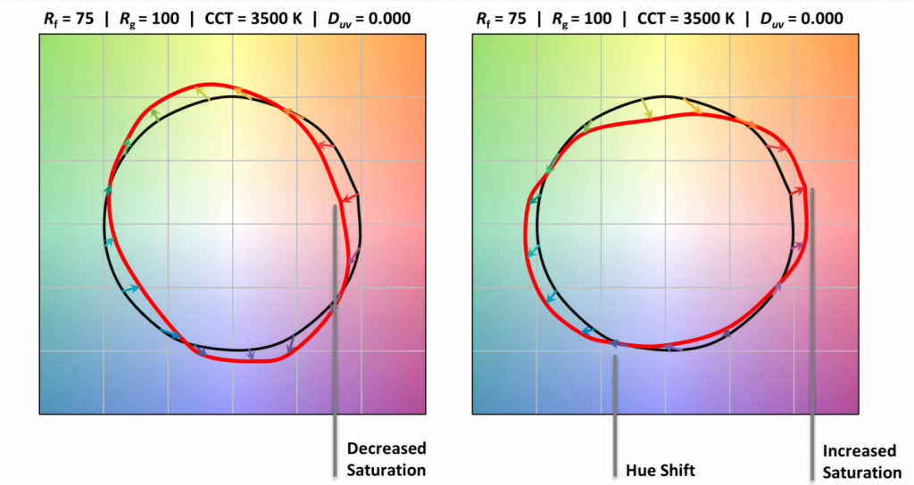
TM-#30’s Vector Graphic. the black circle represents the reference light, while the red circle is the light being tested. Areas it extends past the black circle indicate the colors are more intense as compared to the reference. (Image courtesy of Energy.gov)
Unlike the Fidelity and Gamut Indexes which are numerical scores, the Vector Graphic is a visual representation of which colors are more or less intense. The black circle on the graph shows the reference light and the red circle shows the tested light and where on the color spectrum it over- or under-saturates colors. If the circles are perfectly overlapping, then the tested light matches the sun’s light.
The Fidelity and Gamut Indexes are based on averages and don’t indicate which colors show up better. The Vector Graphic, however, shows which exact color families look better under a given light. This is especially helpful when you need to highlight a particular color, such as in retail applications.
The TM-30 scale remedies the limitations of the older CRI scale by using a large palette of both saturated and pastel colors based on real world uses. Also, by providing numerical scores on color faithfulness and saturation as well as a visualization, it is far clearer, which colors a given light source can render well. The CRI scale is easily “gamed” and the single score doesn’t tell the whole story about the light.
CRI is still on lamp spec sheets and it isn’t going away today. But, it’s an incomplete metric. More and more manufacturers are using TM-30, especially where color quality is important, like in retail and art galleries.
Learn more about Amerlux’s outstanding color quality lights, like SPEQ.