CASE STUDY: How Amerlux Accentuates Connecticut’s Favorite Masterpieces

Photo by Chuck Choi
Perhaps Connecticut’s tourism website says it best: “The Mattatuck Museum is proud to welcome visitors into their beautiful new building.”
Melissa Mattes, a senior lighting designer at Sladen Feinstein Integrated Lighting, located in Boston, could not agree more.
“This is an incredibly beautiful museum. Its façade has a very public presence,” she said.
Mattes, one of Lighting Magazine’s 2020 top 40 under 40 international lighting designers, was the lead designer for the project, which included an expansion and a renovation, both of which tallied a cool $9 million, according to the Hartford Courant daily newspaper.
But, as Mattes said, it needed it. “The museum had some very outdated architectural features,” she recalled.
The exhibition hall, founded in 1877, is prominently located on the main green in downtown Waterbury, Conn., and has been collecting and exhibiting American art and cultural history for more than a century. Its home, an expansive four-story brick building, is a regional attraction for showcasing artistic masterpieces by Connecticut’s favorite artists and highlighting various historical snippets of Naugatuck Valley, a one-time bustling industrial town known for its rubber production and manufacturing synthetic leather.
But the arts center hadn’t undergone a significant renovation in more than 30 years—and it showed.
“That’s why they decided to gut and renovate the museum, with a lot of attention on facility’s interior,” Mattes said.
Among the headline-making upgrades made by Boston-based Ann Beha Architects was first replacing an outdated courtyard and entry added in 1985 with a flexible lobby space highlighted by a distinctive copper ziggurat crowning the main entrance. About 1,500 square feet of new gallery space were added, including two new classrooms, a new plaza and garden, an open foyer, an expanded shop, an outdoor roof terrace and a freight-sized elevator to accommodate large-scale traveling exhibitions.
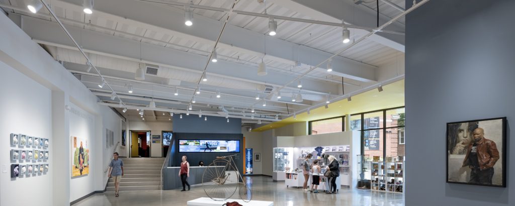
“The client wanted a very clean look—polished concrete floors, open gallery exposed ceilings and visually compelling displays,” Mattes said.
But to do that, the new-look space needed some new-look lighting, primarily through the 2,050-square-foot, first-floor and 800-square-foot, second-floor galleries. Both corridors showcase countless 2D and 3D compositions, including oils, watercolors, drawings, graphics, sculptures, historical documents and ephemeral and decorative art objects.
Tasked with the challenge, Ann Beha Architects knew the right person for the job: Mattes.
“I worked together with the museum to pick a fixed color temperature that would work well with the breadth of displays that would rotate through the museum,” Mattes said, adding that the museum has more than 25 rotating exhibits each year. “They needed flexibility for all the types of work they show.”
There were various other pressing matters the lighting design team had to keep in mind. CRI was one, Mattes said. “We had to have a very high CRI,” she said. Another was a “clean, polished aesthetic appearance.” A third, she added, was having soft scallops for added visual interest. “The client didn’t want any harsh lines or shadows,” she said.
And, of course, price. “It had to be the right fixture at the right price, which isn’t easy to find,” Mattes said.
But after her design team presented a range of options to the museum’s curator, choosing the proper lighting manufacturer was—Amerlux. Three of the award-winning, design-and-manufacture company’s fixtures were chosen.
One was 75 of the SPEQ-M medium cylinder track heads installed throughout the first-floor gallery. Another was 10 Contour® 4×4 track heads, used in a second-floor gallery, and 22 Contour® 3×3 track heads, used on the same level. Of the 107 Amerlux fixtures ordered, most come equipped with 90+ CRI, 3000K, various filters to alter beam spreads and accessories such as solite beam softening lens, snoots, linear spread lens and hexcell louvers.
“Amerlux has an exceptionally clean, architectural look. All their fixtures meet and exceed all our high-performing criteria,” she said. “We needed a lot of flexibility, and Amerlux provided a variety of options that the art curator—from different lenses and distributions to different accessories—could use for each rotating display.”
Mattes added: “Amerlux provided all the samples that we needed right away, and after we presented all the options, the vote was unanimous: The choice was Amerlux.”
The SPEQ-M medium cylinder track heads were used predominantly in the open gallery, where Mattes said they were “needed the most.”
“Amerlux provided the most flexible grid for that gallery as well as the options we needed, particularly with illuminating 2D wall art and the pedestals set up for 3D art collections,” she said. “Amerlux did a really impressive job creating the soft beams and soft scallops that the project demanded. Amerlux was really the best fit.”
The result? A pleased architect and an equally delighted curator.
“They were pleased with the lighting, commenting on how well it lets the museum be the canvas for their art,” Mattes said. “The renovation work completed is respectful to the original architecture, which is historical, but it also pronounces the details of the new modern look. It’s the perfect balance between clean and respectful.”

